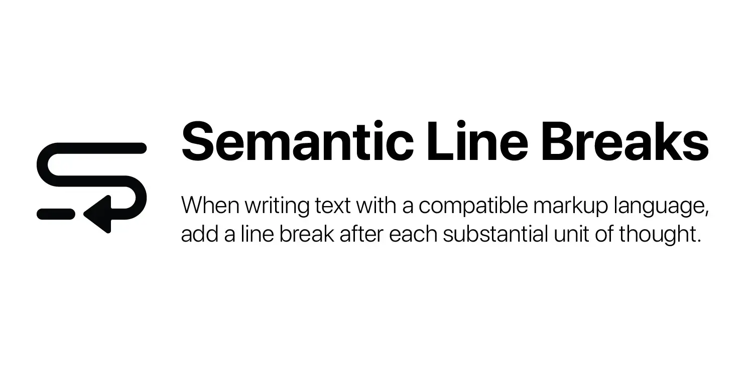
Here’s an interesting idea: When writing a headline, add substantial context so we know what the article is about.
Wow try being nicer I assure you it doesn’t hurt :)
I think your mistake was assuming users woudd read the subtitle you had put in a space Lemmy users are used to seeing dedicated to much more detailed summaries of, or even the entire, content. Even if subtitles are closer to the intended use of that space and you did provide plenty of context with the subtitle.
Try expecting less of people. I assure you it will save you a world of pain and a lot of yelling at clouds.
what subtitle? all i see is the title “Such an interesting idea!” and a link with a thumbnail. is there more information that my client isn’t displaying?
I second the question but from the looks of a web UI maybe the subtitle is what appears under the link?
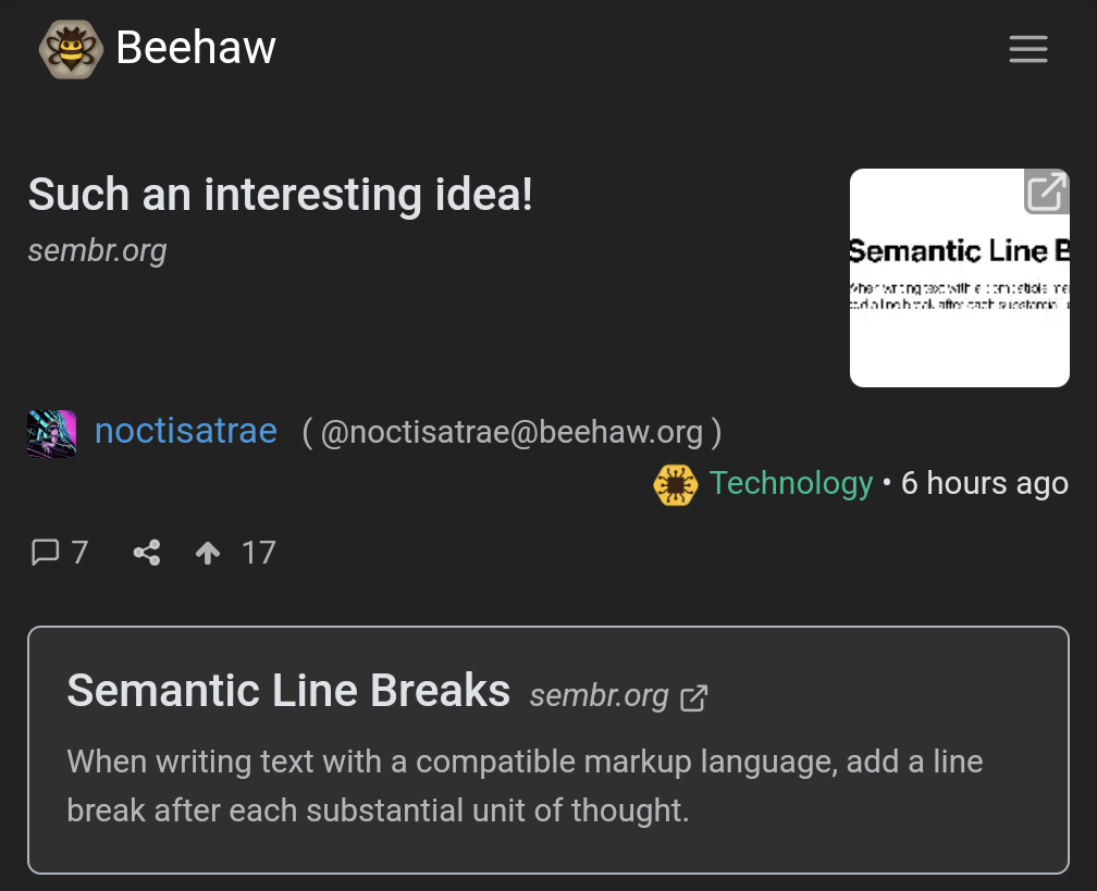
That bottom text, yeah, and a lot of links will have the entire content or a thorough subtitle embedded there, or archive.org/12ft.io versions of the link. On my instance, its collapsed behind a plus sign right after the title, like a comment, but above all the stats and action buttons.
Gotta tap on the plus sign
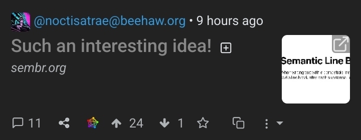 next to their exclamation point …
If your client doesn’t show that, then yes, absolutely,
 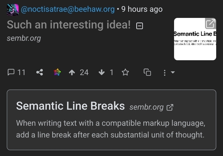 you’re missing out on the full Lemmy experience
At the top level, I can’t even see the subtitle – just the headline, a cropped and highly pixelated thumbnail, and the domain of the linked article. I had to click to get the subtitle, and I wouldn’t have done even that if the headline were more explicit.
Such a weird thing for a Lemmy client(or instance?) to neglect to impliment:

 You’re missing out on the full Lemmy experience
Thanks for pointing that out – I didn’t notice that [+] before (I use the web interface, btw). My original point remains though – I still have to click something to know what we’re talking about.
You don’t even have to leave the feed view or wait for anything to load though. The fact there isn’t an option to auto-expand such text(or is there? idk) is not OP’s problem. They used the functions available to them as intended.
All except “effective communication skills”, and I still had to take some action besides scrolling.
from the thumbnail, i really thought this was gonna be a joke about reinventing paragraphs
Not being intended as a joke makes it even funnier. I mean, the lack of awareness is amazing.
I’m not even sure I understand it if it’s not a joke, and I read the entire thing 😳
A maximum line length of 80 characters is RECOMMENDED.
This is a terrible recommendation. It defeats the purpose of semantic line breaks if you insert them for non-semantic reasons as well. It also makes editing much more difficult. Let client software handle soft line wrapping, so the user can customize it as it makes sense for them. If your client software doesn’t handle soft line wrapping in a sensible way, find better software.
The idea is to keep significant bits of thought under 80 characters.
That should be out of scope for a spec which “MUST NOT alter the final rendered output of the document.”
It’s not the place of a markup language/spec to influence writing style.
Reminds me of this blog post I read a while back: https://sive.rs/1s
deleted by creator


