I’ve heard many people saying that the front-end looks old and needs more work, but I’ve never heard someone describe how it could look better. To me, it looks perfectly fine. I wish it had a card layout similar to libreddit, but aside from that, I think it’s nice. If people want a completely different look, then there’s lemmyBB, and there will probably be other front-ends in the future. However, we should hear opinions about which styles people want.
I don’t like how it feels like a copy of new Reddit. I would prefer a layout similar to old.reddit. This seems geared towards mobile with everything justified in the center so a tone of blank space on either side on desktop
deleted by creator
Main thing that bothers me is when I tap an image to see it enlarged, it just opens it in a browser, which I don’t want…
It’s almost impossible to navigate to other instances via the android app unless they’re saved in your subscriptions.
Yeah, that’s not a lemmy ui issue, though. Links to lemmy communities or posts open in a browser window from jerboa. Is there a standard way that apps should use to determine if a link is to a lemmy object (on any instance) or just a web page? Maybe a
HEADrequest and checking headers?
I’ve tried several apps for Reddit on android over the past few years and this is what I’m currently finding uncomfortable using Jerboa for Lemmy:
- the numbers on the top right corner of the posts are confusing. Like right now they are saying “24 13”. Based on the upvote behavior I think 24 is rating. I’m guessing 13 shows how old is the post but it looks counterintuitive without a measurement unit. Is it 13 mins or 13 hours or 13 months or what?
- is there a way to collapse comment threads?
- on some of my previous apps for Reddit there was a way to hide read posts. I don’t really want to scroll past everything I’ve already seen every time I open the app.
That said, I really like Lemmy and hope it’ll get the fanbase it deserves.
hold the top bar of a comment down to collapse it
Oh, thank you, today I learned something new :3
is there a way to collapse comment threads
Tab and hold top of the comment.
I would say the main improvement could be the available app customization and features. Right now it’s very barebones, I can’t even find how to sort comments by their upvotes (if someone knows how, let me know), I also can’t collapse comments which makes it very hard to go through a lot of replies. I’m using Jerboa currently
I actually really enjoy the theme and general layout, maybe some small quality of life adjustments. My bigger concern would be things like profile import/export so people can move to different servers, fixing the ability to customize your default starting page (All / Active, Subscribed / Top for Day, etc.). We may need a good way to share a link to the post & its thread, I did share a link to someone and it provided only the post’s image, it could be a misunderstanding on my part, but I was wanting the recipient to also be able to view the comments.
I love the theming and how intuitive everything is given the complex environment.
I think it should look a bit more like old.reddit + RES (though not a copy). Pretty much if the choice is between looking more like old.reddit + RES or looking like new Reddit, go with the old.
Some specific issues I am seeing:
Half my screen is dead space, and why is the sidebar right up against the main column of text?
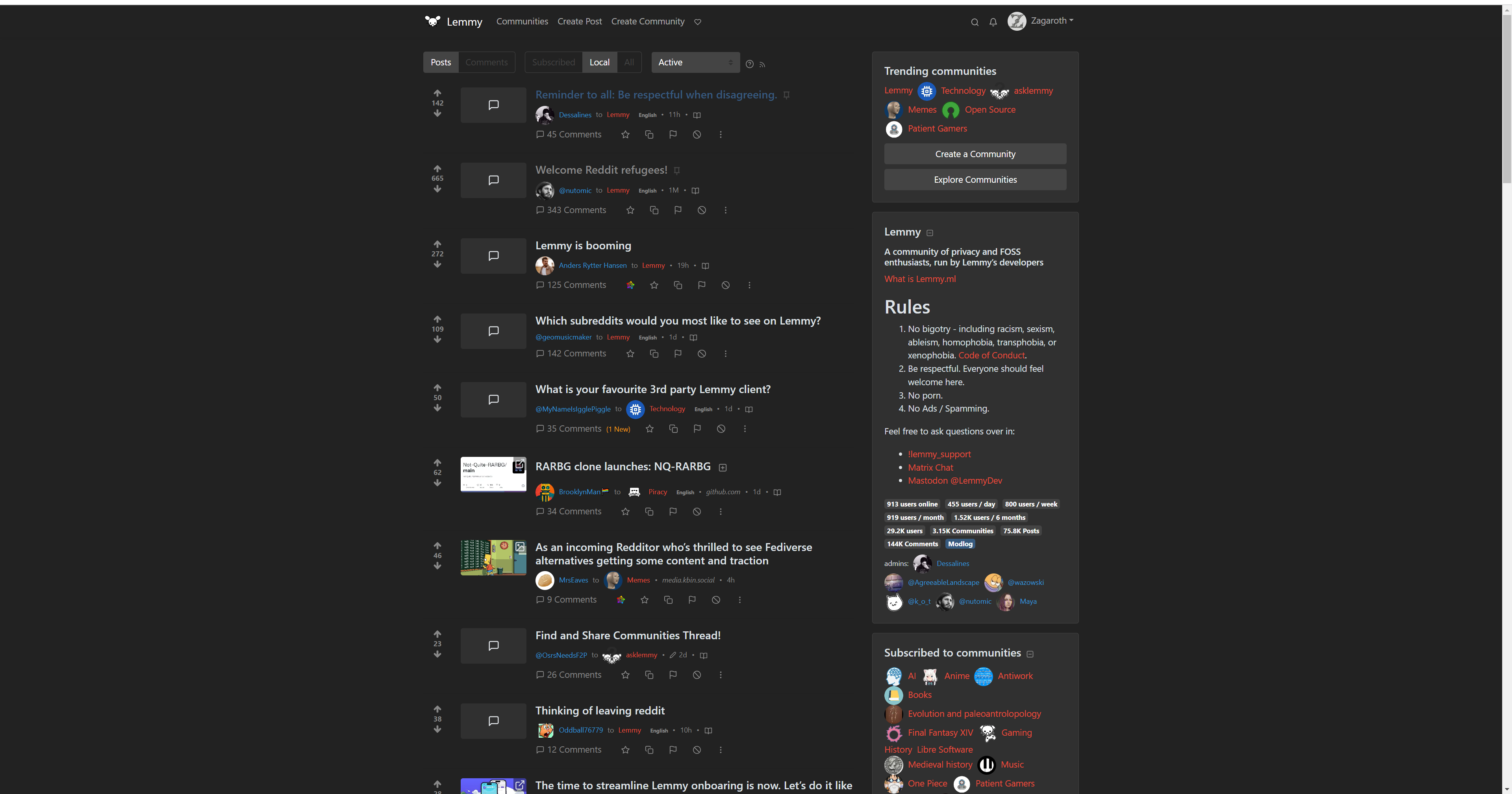
Extraneous stuff should be right (or left, depending on layout) justified, putting space between the main content and the sidebar. Also, let the center column be wider if someone has a wider screen.
I would like to be able to expand text or images without going all the way into the post. Basically, push everything else down and show the post, but leave the user on the front page and don’t load the comments.
It would be very cool to partner with a designer and improve the UX in a professional manner
Not sure about desktop but on mobile, I don’t really get the “Sidebar+” button. Want to make a post? For some reason you need to press Sidebar then create post. On a community page, I’d have this literally as its own “Create Post” button.
I’m also not sure if there’s a quick way to get to a community I created. I need to go to my profile and find my post on the community to get to it.
The only thing I would like is a more compact UI, it feels lime a lot of the screen is taken up by big text and whitespace.
Make sure yall open issues (specific ones please, not a ton in one issue), on the lemmy-ui github. Otherwise they’ll likely get lost, and people won’t be able to work on them easily.
