

Its like a modern day impact font.
Transcript
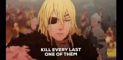
A ferret with its head in a glass bowl full of water, with the caption “dink my oiter”, meant to be “drink my water”.
You must log in or register to comment.
The font is called Upright Regular and it was used in the now defunct Whisper app
Their website had it up for download before it shut down, so I went snooping around web archive and found this snapshot that has the download link near the bottom of the page where they list the fonts they used in their branding
Damn you beat me to it. I found this by doing some image manipulation and using a font analyzer: https://www.whatfontis.com/ENVG_Upright-Retro-Inspired-Headline-Font.font
you can get it here (thanks Darkore)
It’s a nice font but it looks mushy even at very large sizes.
Nice! Thanks
It’s the font from whisper.sh which I’m sure isn’t a thing anymore
I’ve been wondering about this. It seems like it’s been around for a long time, but I’m seeing it more recently.
I kinda like the letterforms, even though the kerning and balance of visual weight are terrible. . . . . . oiter
I think it is literally just lowercase impact font but I’m pulling this answer straight out of my ass
Doesn’t look like it to me. https://www.dafontfree.io/impact-font/ shows lowercase that’s radically different to this. Look at the y for example.
That doesn’t rule out variant glyphs or another member of a hypothetical Impact family, but I’m leaning towards no.


