- cross-posted to:
- main@rblind.com
- cross-posted to:
- main@rblind.com
I was making a braille learning app when I came up with this game idea. You count the braille dots to guess the word. https://www.themisgames.com/brailliance/menu
Do you think it’s too hard? I want to experiment with ways to make it easier. I’m also actively working to add more iOS-specific VoiceOver support with a native app. Perhaps make the perkins input easier.
I think it’s a good game. I’m proberbly not the target for this kind of game, since I’m not very good at word games.
I found this game a little too hard, but other players might find the difficulty to be good. Wordle wasn’t my kind of game either. Maybe highlighting vowels could make it slightly easier for dumdums like myself, but I have no idea if that would make an effect.The UI feels refined and even the web version on mobile has a native feel. If it didn’t have a share button to compare the daily challenges with friends thrugh pasting in groupchats, I think you should add that (I couldn’t solve the daily challenge, thats why I don’t know if it’s implemented)
Hey, you can cross-post this to rblind.com!
lol. I thought I did post it to main. Shows how much I know about how this site works, huh. I’ll try to figure out how to do that.
I second @ben@feddit.dk, it’s a really nice game! Extremely well-polished, the UI and color theme are gorgeous, and the sounds work perfectly.
Initial thoughts on the game difficulty:
Having to add up the number values adds an incredible amount of complexity (for my brain at least) — even finding a word to start with takes a lot of time, especially since you don’t know how many letters you’re aiming for.
I don’t want to spoil the current daily, but my first word gave me three greens. I thought I remembered the tutorial saying that green means “correct letter”, without saying anything about the position.
Personally, I think this is a bit of a shame; after the initial relief of finding a word that fits the Dot Requirement (DR), I’m now stuck with knowing three letters, but I still don’t know the word length, and I don’t know if the letters are in the right place.
I have to go hunting for words that contain my three green letters (and none of my grey ones), but even when I manage to think of something, I then have to fulfill the DR, which means a lot of the words I come up with don’t even work.
For a second just now, I thought I had come up with a workable strategy: since there is no apparent word length limit (other than dictated by PR), I could just take my green letters, and try to find a single letter to add. Slow going, but at least I’d be working towards a solution. Then I start typing my new, 4-letter word, and I realize that I’ve forgotten about the DR. Which promptly negates the word I wanted to try.
Obviously, everyone’s brains work differently, and I might just be particularly bad at this specific task, but I simply find it too hard.
I understand that optional settings that affect difficulty are a bit iffy because they could affect any scoreboards that might be added (not seeing any as of yet), but I think those could be taken into account.
Some ideas and suggestions that I think could make the game more accessible to players who find it a bit too hard:
-
Letter Placement Clues (LPC) — Consider differentiating between whether a correct (currently green) letter is in the right place or not; grey still means “wrong letter”, yellow (or maybe that delightful peach color from the Enter button) indicates “correct letter, wrong placement”, and green indicates “correct letter, correct placement”. LPC could be an optional toggle in Settings. This genre of game can usually be condensed down to “Mastermind with Letters”, and even Mastermind indicates correct placement (although omitting which letter is correctly placed).
-
Word Length Clues (WLC) — Consider letting the player know how long the target word is. WLC could be an optional toggle in Settings.
-
Tackling scoreboards vs. clue use — If the above (or other) clue settings were implemented, and if a scoreboard gets implemented, the scoreboard could have a tab for each combination of clues:
-
No Clues Used — main scoreboard, doesn’t need to explicitly say anything about clues.
-
LPC used — scores from plays with only LPC enabled.
-
WLC used — scores from plays with only WLC enabled.
-
LPC + WLC used — scores from plays with both clues enabled.
-
Maybe a simple icon could be created for each clue type, and a small icon key shown at the bottom of the scoreboards to indicate which tab has which scores, without having to actually write “LPC” and "WLC”, or some other silly acronym.
-
-
Point of friction: “Not a Valid Word” — When typing words, a Friendly Chime (FC) sounds when the DR is Satisfied (DRS), supported by the X/Y Counter (XYC) numbers turning green. However, when the word is submitted (Enter button), and only then, the “XXX is Not a Valid Word” notification (NVW) appears (only if it’s not a valid word, obviously). The NVW is not accompanied by a sound, nor any other visual indication, and it’s a bit anonymous. I just had this happen, and I kept pressing the Enter button a few times before noticing the NVW.
Is it really necessary to have to Enter to get the NVW? If PRS, I’m clearly not going to add any more letters; I already spent the
pipdot quota. I think DRS should trigger the NVW evaluation, without the player needing to press Enter, as it seems an unnecessary step. I’ll call this DRS→NVW.- Suggestion: Better / more NVW indicators upon NVW-eval causing DRS→NVW (in addition to current notification):
- Entered letters could turn grey.
- Enter button could be greyed out.
- Entered letters could do a Little Shudder (LS) / shake from side to side.
- A different sound from the FC could play, maybe a Low Note from a Marimba (LNM) or something similar?
- Suggestion: Better / more NVW indicators upon NVW-eval causing DRS→NVW (in addition to current notification):
-
Consistency: “There must be Exactly X Dots” notification (EXD) — Similarly to the points made for NVW notification above, EXD-eval could trigger on each entered letter, and show EXD notification if total dots entered > DR, instead of only happening after player presses Enter. Some of the extra NVW indicators from above could also carry over to EXD for the sake of consistency:
- Better / more EXD indicators when player presses Enter without DRS (in addition to current notification):
- Entered letters do a LS.
- LNM plays.
- X in XYC turns red.
- Better / more EXD indicators when player presses Enter without DRS (in addition to current notification):
-
A thoughts on learning braille — I know available space is a bit sparse, but I think adding the dots to the letters of already entered words would make it more likely that I started associating the dots with the letters. Seeing the dots in the context of a word I spelled would just hammer the point home a bit more; currently, I can see the dots on the keyboard, on the letters I’m currently adding, but not on the words I already entered.
-
Bug? “There must be Exactly X Dots” (EXD) — I actually can’t reproduce this now, but I just had a situation where EXD was displayed at the same time as DRS. Not sure how I did it, though. If DRS, then EXD shouldn’t be shown, because DRS = exact number of dots is satisfied = no need to explain how many dots are needed.
That’s what I have, off the top of my head. Would love to hear your thoughts, and will come back and update if any other ideas pop up 😊
If you made it this far through my acronym bonanza, thanks! I don’t know if any of the above is useful, but I thought it was worth spending some time on this, as I think the game has great potential, and would be something I would like to play more, were it not for the current difficulty.
@renard_roux@beehaw.org Sorry for the late reply. That was a doozy of a feedback response and we’ve been busy working through it.
I admit I did indeed have to find and replace all the acronyms for me to understand it fully. Haha!
We’ve gone and made a radical tweak to the gameplay, both directly and indirectly addressing your concerns along the way. Players can now make guesses below the dot sum requirement. This makes getting started on a level much easier, though you are still required to bunker down and do the math on your final answer. We’d love to know what you think about it.
We’ve also gone ahead and implemented optional starting hints, giving an example word of the correct dot length on the first turn of each level.
Also at your behest, a sound now plays for invalid words immediately upon reaching the correct number of dots. We will probably expand this to other interactions as well, and I still have to work out Safari’s weird screen reader timing on iPhones.
As for your remaining feedback, I am currently setting up new features as A/B tests we can run and see what works best. Internally, we still like the freedom this design gives the player compared to something like Wordle, and we want to keep that identity alive wherever it suits the gameplay. We think the new changes go some way toward that goal.
Keep the feedback coming! This is great!
Wow, that looks great! I was beginning to think you’d missed my comment, or, worse, that it was too annoying 😅
Happy you managed to translate the acronyms and found some of it helpful; I spent way too much time on it 😅
Think the changes are really good! Being allowed to enter words that don’t live up to the dot requirement really takes a lot of friction out of it and makes it so much more enjoyable!
Looking forward to seeing future updates, keep up the good work!
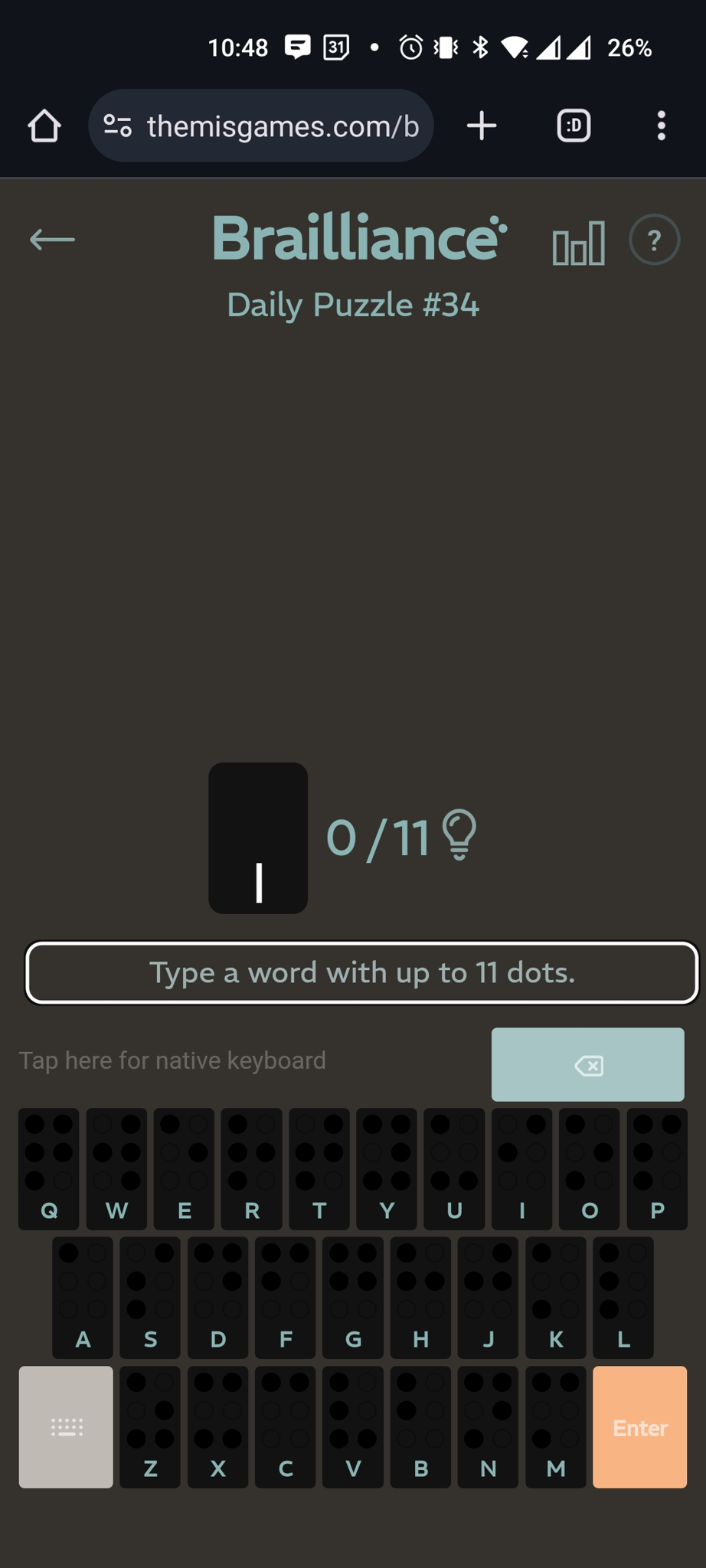
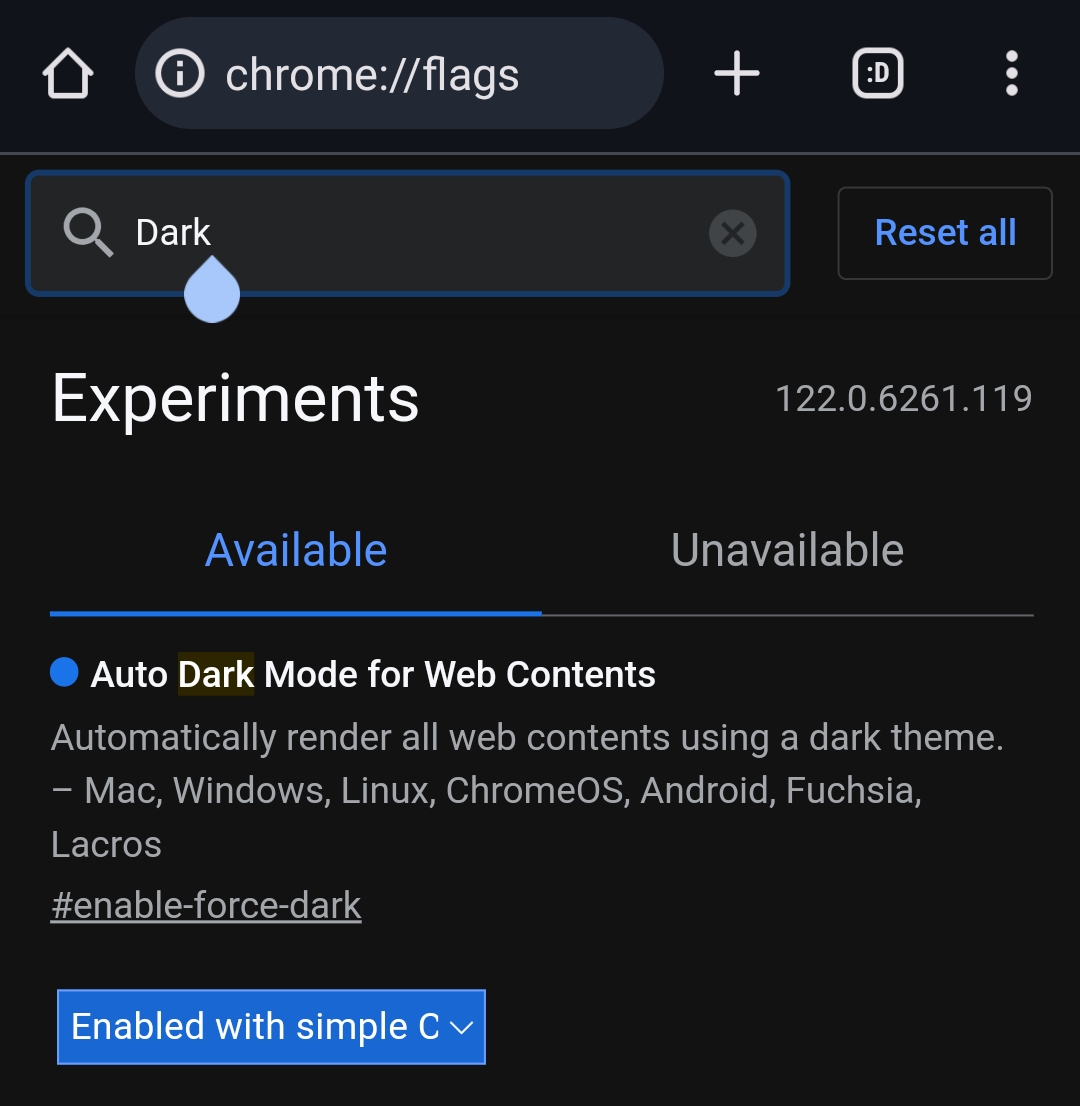
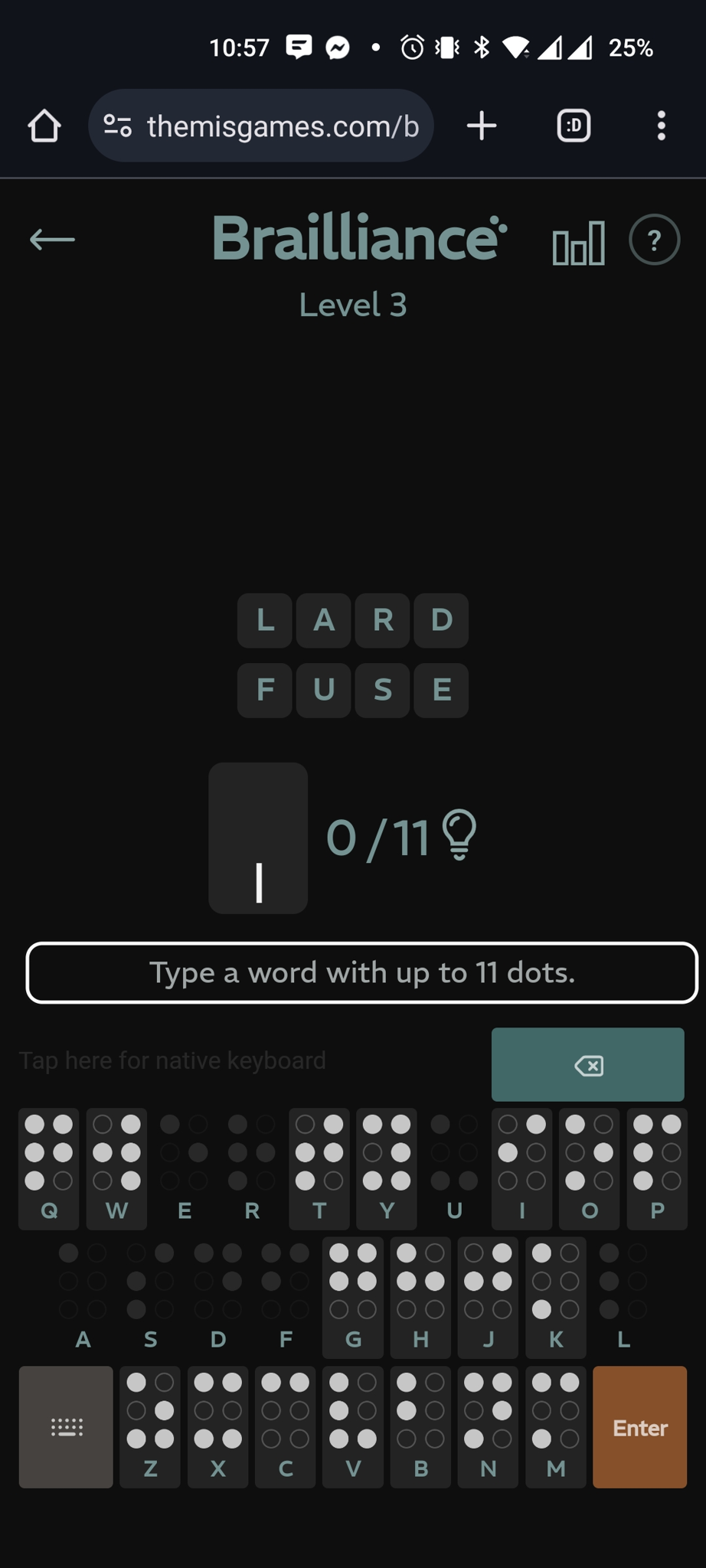
I actually stumbled upon a small issue: in Chrome on my Android phone, I’ve enabled a flag to force dark mode, and it doesn’t play nicely with the game. An edge-case for sure, but might be worth looking into. See screenshots below 😊
.
- Chrome Dark Mode flag enabled, game in Light Mode:

.
- The flag in question:

.
- Dark Mode enabled + game Dark Mode toggled:

That experimental flag is frustrating. I ran a quick test to see if it would honor the w3 dark mode guidelines and it doesn’t seem to on my test devices. Our game already asks the browser for the system theme preference and assigns dark mode accordingly. The flag set to force CSS changes might just never be compatible.
- Chrome Dark Mode flag enabled, game in Light Mode:
-


