

Are those graphs accurate? The modern one seems right, but I have no idea about pre-revolution France
is the modern one right? Why are there two bars per quintile? Isn’t the top 10% above 90% of the populations wealth?
Now show the top 0.01% as their own bar
What does France’s distribution look like these days?
I found a couple of interesting graphs:
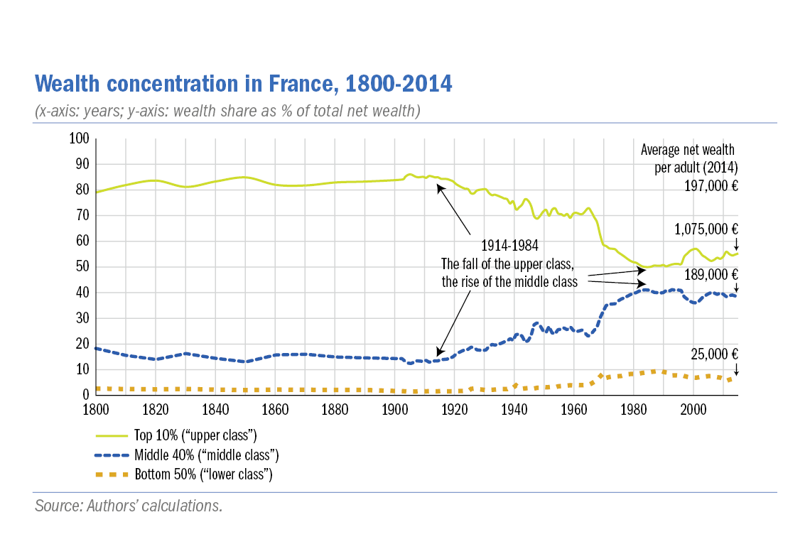
I dont really like how this first one divided their different groups (there’s probably a fairly major difference between the lower end of “middle class” and the top which brings up their percentage) and the way percentages work really skews the scale, but it does paint a similar picture. This second one is the more interesting, I think, because it shows that income inequality is pretty similar across many countries - before taxes. Taxes seem to be the big equalizer in other countries, with France going from slightly worse than the US before taxes to roughly two times closer to “perfect equality,” according to the metric they used, which puts it nearly on par with Sweden, who is miles ahead of every other country before taxes. This alone doesn’t say anything about wealth inequality due to how the wealthy actually live and use their wealth, but it does paint a picture of how closing tax loopholes can work.

You’re mixing two different kinds of inequality here, The top graph is wealth (aka savings), while the bottom one is income. Wealth is the much harder one to crack, and Sweden actually has much higher wealth inequality than all of the other countries being compared.
It’s worth noting that one of the main reasons that Sweden has relatively equal income before tax is because of the way the tax system works. Because social security contributions cap out at ~$70k/year, similar to the US, but there is no similar cut off for social security payroll taxes, employers generally pay their employees in dividends and private pensions instead of income, above that $70k level. Taxes are generally flat in Sweden, though.
- a swede
Pretty much the same. This kind of graph is basically useless because the axes are quasi-proportional to each other so it always looks similar.
Also, France top 10% are at 60% and US top 10% are at 75%
So, who’s gonna be Robespierre?
We don’t need a Robespierre. No man can throw the One Ring into Mount Doom.
We need an organizing council that cannot take political power.
JFK junior?
Isn’t… Isn’t he already dead?? Like 25 years ago?
Depends on who you ask
So what is the hint we are dropping?
The French Revolution started in 1789.
The hint that we have way to few guillotines at hand.
Naah he’s 6 inches 4 cm.
What are China and Russia like, for comparison?
>Open post criticizing the US
>Look inside
>Whataboutism
Every time
We can criticize both you know.
But a graph comparing authoritarian regimes would be nice as a reply to these dumb tankies shilling for dictators and imperialism.
It’s a weak criticism without comparisons. As others in the comments pointed out, most countries around the world have similar numbers, and I don’t think we’re on the brink of a worldwide revolution lol
Plus it’s not like France was some bastion of democracy after the French Revolution, we should really be trying to avoid past mistakes.
And since people who often post such hyper-fixated US-centric economic critiques usually argue in favor of China, I genuinely wanted to know how China’s numbers look too. I’m certain Russia’s numbers are fucking terrible but I wanted a laugh so I included them.
I’ma need more than a sample size of 2.


